Landauer claims that taking into account the UX of the site since it’s been created can increase the conversion by 700%. That is, if the navigation on the site is simple and clear, if it loads quickly and is easy to use, this will have a positive impact on your customer’s journey!
We’ve put together a few tips for improving your website’s UX to increase conversion rates.
Of course, you will need a modern, well-thought-out website first. Today, starting a free website using a modern website builder Weblium (Weblium.com) is an easy, quick, and inexpensive way to increase your online presence!
Table of Contents
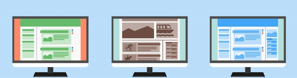
1. Opt for a mobile-adaptive design
With the current competition and an increasing percentage of mobile users, mobile-friendly design is a must.
The concept of responsive design will allow you to optimize your website layout in such a way that you won’t need to create a separate mobile version of the site.
Don’t forget to test your mobile-friendly design with special tools like a responsive-design test or mattkersley.
Many modern website builders create mobile-friendly designs for their templates. For example, Weblium, the progressive website builder offers 250+ professional templates with an adaptive design even on a free plan.
2. Reduce page load time
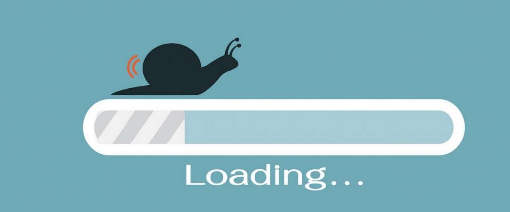
img source: theimpulsedigital.com
When designing a website, pay special attention to page load time: about 40% of all users will not continue browsing a site that takes more than 3 seconds to load. What’s more, shoppers who are dissatisfied with the user experience are likely to no longer shop on this site.
3. Think about your target audience when creating design
Create a layout that maximally conveys the essence of your proposal and meets the preferences of the target audience.
For a young audience under 25, create a vivid dynamic design, add animations, graphics. Older audiences from 35 to 45 may find such special effects annoying. Use neutral tones and a classic conservative style if your target audience is used to it: complex products, industry, specific B2B segment.
4. Simplify the perception with clear navigation

img source: sleeknote.com
These tips will help you improve your site’s navigation:
- pin your site’s navigation bar to the top of the page and do not add a large number of links to it;
- add a link to the main page to your logo;
- add markers to help visitor orient on the page;
- show the process of loading and scrolling the page;
- add a “go up” navigation button.
Creating the correct structure and intuitive navigation may be a tough task. But some modern website builders have taken care of that too. For example, all Weblium templates are created based on an in-depth study of the world’s most successful niche sites, so any of these templates have the correct structure and clear navigation.
5. Form a clear hierarchy of site elements
Scattered elements confuse visitors, making them want to leave the site.
Create a hierarchical organization of design elements and help the potential customer distinguish the important elements from the secondary ones. To make the primary element more visible, increase its size, brightness, add animation.
For example, you can create 3 levels of headings:
- the first one is a catchy heading with primary information,
- the second one is less striking subheading that helps the user find certain sections of the site,
- the third one is a non-standout text, just a description.
6. Show your benefits on the first screen
img source: imgix.net
You have 3 seconds to convey the essence of your offer to a potential buyer. Create associations with your product or service using colors, photos, and fonts.
For example, the title of one sales course is: “Learn how to make your sales department reach the 100% potential and increase the company’s bottom line by 2.5 times in just 3 months”. The main information (“100% return” and “2.5 times in just 3 months”) is highlighted in red.
7. Use negative space
By negative space, we mean the space between large and small site elements (letters, lines, design elements). It focuses the visitor’s attention on the main things and makes it easier for him to perceive the most important information. Conversion rate optimization agency Conversionrate.store tested removing all elements apart from headlines, form and CTA from client’s home page and it delivered 9,83% uplift in conversion to purchase only as a result of negative space.
How to use negative space to keep users focused:
- create more space between letters if you use a smaller font;
- use 1.5 line spacing;
- divide large blocks of text into smaller ones for better understanding;
- separate large site elements with wide margins and indents.
8. Create simple lead forms
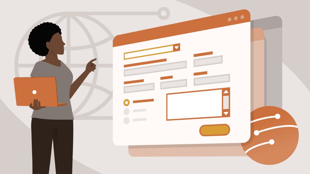
img source: lynda.com
Place your web forms away from other elements on the page. People often shift their attention. Such a technique will allow visitors to quickly perceive information and help them to make a positive decision.
9. Create clear and visible calls to action
Help your potential customers make a decision: use the bright colors to highlight CTA buttons. Follow the so-called “rule of thirds” to find the best location for your CTAs.
According to it, you should visually divide the page space into three parts horizontally and vertically with two lines. The intersections of these lines are the “power points” that get the most attention.
Place the most important elements (for example, calls to action) at the bottom left corner.
10. Make A/B tests, but make it right!
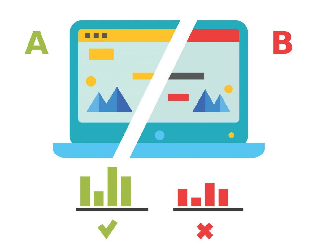
img source: invespcro.com
Test different page variations, showing them to your website visitors.
- Before starting the test, define the parameters: income, transactions, goals, session duration, bounces, page views.
- Indicate the sample size.
- Create a hypothesis based on a click or scroll heatmap and use it to test your website’s buttons, titles, images, and forms.
- Test one hypothesis at a time.
- After the end of the test, analyze the results.
The goal of the UX approach in web design is to develop a product that has visual and logical integrity. It should also touch the user’s emotions, evoke empathy, and help solve the problem, making the visitor’s life better. Use the user experience design services to be sure of your result.