COVID-19 pandemic crisis has, among other things, radically reshaped the global economy. Not only has it irreversibly changed our shopping habits, but also forced most businesses and entire industries to fully or partially accelerate their shift from traditional stores to online sales. The time of lockdown in many countries forced shops and stores around the world to shut for months and to reopen under strict new regulations. All this caused an unthinkable boom of e-commerce. If you’re selling literally anything – from shoes to pet accessories – you need to board this train: the time is now.
An e-commerce site offers you great opportunities to find more customers, to build your brand, to sell more items, and last but not the least, to increase your profit. When creating a webshop, design plays a critical role. A nicely designed e-com site, with the right colors, fonts, images, and text should attract potential buyers and present your brand and your shop in the best possible manner. But not only should your website be visually appealing – it should also provide great user experience, easily navigate your customers through your virtual world, and help them buy your stuff.
‘’OK, easier said than done. But how should I do that?’, you must have thought. How to design an e-com site that’ll be eye-catchy and stand out from the crowd? Although there are numerous platforms, the BigCommerce platform like this one distinct due to its dedication to creating neatly designed web pages that’ll help you significantly increase conversions. Therefore, here are 6 BigCommerce tips that will help your online shop attract more buyers.
Table of Contents
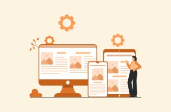
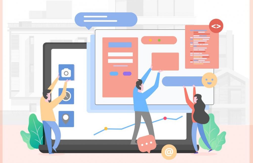
1. Keep your design clean and simple
img source: rocket.com
When it comes to designing an e-commerce site, there’s a single golden rule: ‘Simple is always better!’ The more elements you have on your webshop, it’s more likely that your potential customers will find it unorganized, difficult for navigating, and that they’ll just leave the web page in the middle of the search. And you certainly don’t want that, do you? So keep your design neat and clean, and remove all necessary elements from your virtual playground.
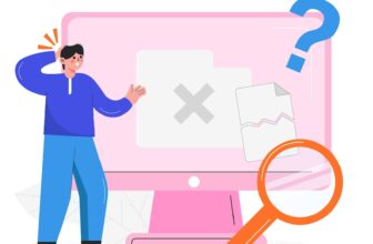
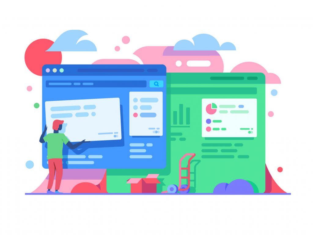
2. Keep your site organized and easy to navigate
img source: medium.com
Just because you don’t have a physical but an online store, it doesn’t mean that you should arrange your products randomly. Try to put yourself in your customers’ shoes. Would you like to see a mess of an online shop? No, certainly not.
So the best tip is to organize your items into categories so that your customers can smoothly navigate through the different types of items you offer and find your deal of the day easily. You don’t need to put too many products on your store homepage – it’s better to have larger images but fewer articles. Also, keep your item prices and descriptions clearly viewed and labeled.
3. Make colors work for you
img source: frooition.com
When deciding which color to use for your e-commerce website you should know that choosing the right color isn’t just a matter of your personal preference. Let’s say your favorite color is, for example, green – it doesn’t mean that you should automatically choose green as your color of choice for the entire webshop.
Color could be a very powerful tool for your web place if you know how to use it wisely. You know how diverse colors inspire different feelings, actions, and emotions from diverse people. Therefore, if we assume that your goal is to make people buy your products, make the purchase ‘Buy now’ button stands out with red color. According to color psychology, red is a color that inspires passion and excitement which are the main factors behind the decision of spending. We already mentioned green – in case you’re selling environmental or outdoor products for gardens, it should definitely dominate on your webshop. If you want to learn more about high-quality design, take a look at this professional web design agency.
Lear more on: https://sixads.net/blog/color-psychology/
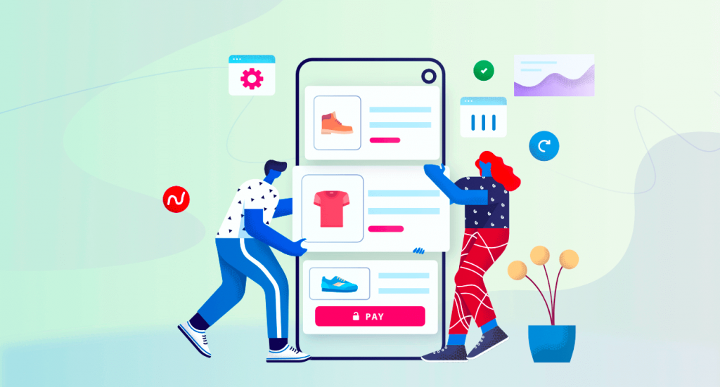
4. Use high-quality images

img source: dinarys.com
Ask yourself: would you buy a product without seeing it first? Of course not. Neither would your customers. A recent relevant study showed that adding a more relevant image into a site design increases conversions by more than 40%. And when it comes to e-com websites it’s probably even more. If you want people to buy your products you need high-quality images to show them what they’re about to purchase.
These details will increase trust and confidence in your potential buyers. When they know what they’re buying, they’ll be more likely to make a purchase. And the opposite – if there are no professional products’ photos or if the photos are custom and in low resolution, they’ll probably be hesitant and doubt your credibility. Therefore, whatever you’re selling online, take care of this aspect and you’ll probably see good results.
5. Add customer reviews

img source: vendasta.com
According to recent research, more than 60% of people who buy online read customer reviews before making a purchase. This is because people will feel more confident to buy a product when they see that other people are satisfied with the same item bought in the same online shop. So, enabling the option for customer reviews on your online place below your product descriptions will add more credibility both to your store and your products.
6. Optimize your shop for mobile
img source: acquire.io
Another quite important tip is to make sure your online shop is optimized for mobile devices. We’re witnessing the unstoppable trend of making online purchases through smartphones and tablets. This means that you need to make your items and their images nicely visible on smaller screens. Of course, all other elements of your online store like product categories, prices, purchase, and payment options have to be visible and easy to navigate.
Have in mind that if your e-com site is providing the same quality user experience on mobile devices it’ll make it look reliable and confident in the eyes of your customers. But in case you face any issues, it isn’t a shame to ask for a helping hand from experts. The job of prominent teams like Optimum 7 and other similar crews is to make people’s virtual corners look modern and attractive to potential buyers – and new ideas are always more than cherished.
Designing a good BigCommerce website in 2024 could be challenging, but now you can use some of these great designing tips above to create it. There comes an online shop that not only looks amazing but also helps you reach more customers and increase your sales in a flash – and that’s basically all you need!