
I’ve been in the trenches of web development for a while now, and if there’s one thing I’ve learned, it’s that a good user experience (UX) can make or break a website.
Your website is often the first interaction someone has with your brand. You want it to be memorable, and not in a “Wow, that was terrible” kind of way. So, let’s chat about how to revamp your site to make it more user-friendly and engaging.
Table of Contents
Start with the Basics – Speed Matters
Optimize Your Load Times

When a website takes forever to load, users bounce. Simple as that. To ensure your site is snappy, here’s what you can do:
- Compress Images: Large image files are a common culprit for slow load times. Tools like TinyPNG can help reduce file sizes without sacrificing quality.
- Minimize HTTP Requests: Each element on your page (images, scripts, CSS files) requires an HTTP request. The fewer requests, the faster your page loads. Combine files where possible.
- Enable Browser Caching: This allows your website to store some data on a visitor’s computer, so the next time they visit, it loads faster.
- Use a Content Delivery Network (CDN): CDNs store copies of your site on servers around the world, speeding up load times for international visitors.
Make Navigation a Breeze
Simplify Your Menu
A cluttered menu can overwhelm visitors. Aim for simplicity:
- Limit Menu Items: Stick to the essentials. Too many options can be paralyzing.
- Use Clear Labels: Avoid jargon. Use terms your audience will immediately recognize.
- Include a Search Bar: Sometimes, users know exactly what they’re looking for. Make it easy for them to find it.
Breadcrumbs for the Win
You know those little breadcrumb trails you sometimes see at the top of websites? The ones that show you exactly where you are on the site and how you got there? Those things can be a real lifesaver, especially when you’re navigating through a website with tons of content.
It’s so easy to get lost in the maze of pages and links, but those handy breadcrumbs act like a trail of digital breadcrumbs (pun intended!) to help guide you back the way you came. They give you that all-important sense of context and orientation, so you never feel completely adrift.
Even if you find yourself deep in the bowels of the site, those breadcrumbs make it a breeze to retrace your steps and get back to where you started. It’s like having a trusty map to lead you out of the woods. They take the stress and confusion out of exploring a complex website, which is a huge relief for us all.
Design with the User in Mind
Source: aloa.co
When redesigning your website, consider affordable web design solutions that don’t compromise on quality. For professional, budget-friendly options, check out affordable web design.
Embrace White Space
White space (or negative space) isn’t wasted space. It makes your content more readable and less overwhelming. Give your elements room to breathe.
Mobile Responsiveness
With more people browsing on their phones than ever before, your site needs to look good on all screen sizes. Here’s how to ensure your site is mobile-friendly:
- Responsive Design: Use flexible grids and layouts that adapt to different screen sizes.
- Touch-Friendly Buttons: Make sure buttons and links are big enough to be tapped easily.
- Avoid Pop-Ups: They’re especially annoying on mobile devices and can cause users to leave your site in frustration.
Content is King, But Only if It’s Relevant
Keep It Fresh

Regularly update your content to keep it relevant and engaging. Stale content can make your site feel abandoned. Plus, search engines love fresh content.
Write for Your Audience
Know who you’re talking to. Tailor your content to their needs and interests. Use a tone that resonates with them. If you’re a tech company, a conversational, slightly nerdy tone might be perfect. If you’re a financial advisor, a more formal tone might be better.
Break It Up
Walls of text can be intimidating. Break up your content with headings, bullet points, and images. This makes it easier to scan and keeps users engaged.
Accessibility Is a Must, Not an Option
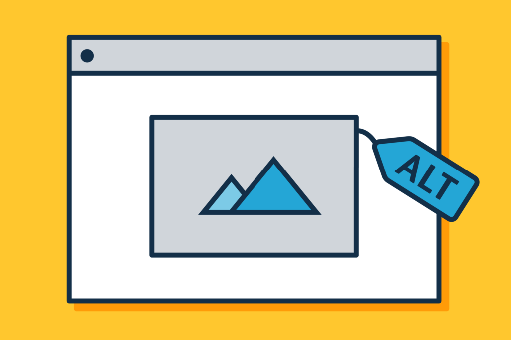
Use Alt Text for Images
Source: design102.blog.gov.uk
Alt text (descriptions of images for screen readers) helps visually impaired users understand what’s on your page. It’s also good for SEO.
Keyboard Navigation
Ensure your site can be navigated using a keyboard. Some users can’t use a mouse, so keyboard accessibility is crucial.
Contrast and Readability
Make sure your text stands out against the background. High contrast improves readability for everyone, especially those with visual impairments.
Feedback is Your Friend
User Testing
Get real people to test your site. Watch how they interact with it. Note where they get stuck or confused. This insight is invaluable for improving UX.
Analytics
Use tools like Google Analytics to track user behavior. Pay attention to metrics like bounce rate, time on site, and pages per session. They can tell you a lot about how users are experiencing your site.
Surveys and Feedback Forms
Ask your users for their opinions. Simple surveys or feedback forms can provide direct insights into what’s working and what isn’t.
Keep the Tech in Check
Regular Updates

Source: linkedin.com
Keep your software, plugins, and themes up to date. This not only ensures your site runs smoothly but also keeps it secure.
Monitor for Broken Links
Broken links are frustrating for users and bad for SEO. Use tools like Broken Link Checker to find and fix them.
Security Matters
A secure site builds trust with your users. Use HTTPS, keep your software updated, and consider adding security plugins if you’re using platforms like WordPress.
Final Thoughts
Revamping your website for a better user experience is an ongoing process. It’s about making small, thoughtful changes that add up to a big impact. By focusing on speed, navigation, design, content, accessibility, feedback, and tech maintenance, you can create a site that not only attracts visitors but keeps them coming back.
Remember, the goal is to make your website a pleasure to use. When your visitors have a positive experience, they’re more likely to engage with your content, trust your brand, and become loyal customers.