
You’ve got a website, but do you know what makes it work? In this article, we’ll show you seven common mistakes that kill sales.
The most important thing for any business owner is to understand how people use websites. This will allow you to create an effective site that gets results.
Table of Contents
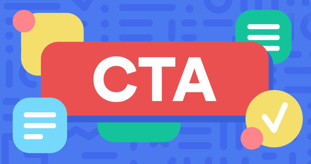
Not Having a Clear Call To Action (CTA).
A clear call to action is one of the most important things when designing a website. It’s also one of the hardest things to design. If you’re not sure where to start, here’s a tip to help you out. Use the LFT model – The LIFT Model draws on the 6 conversion factors to evaluate experiences from the perspective of your page visitor: Value Proposition, Clarity, Relevance, Distraction, Urgency, and Anxiety.
Source: grammarly.com
Poorly Written Headlines.
Don’t make people read through your entire headline before clicking on your link. Make them click right away so they can see what they’re getting into.
Bad Landing Pages.
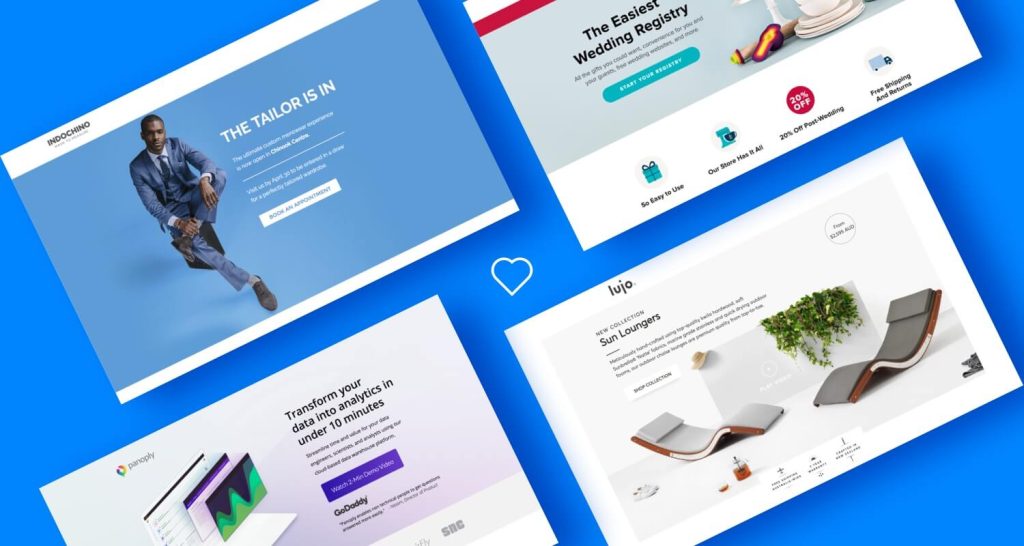
A landing page is the first thing visitors will see when they arrive at your site. It’s also where you want them to stay. If they leave without buying anything, you lose money. So, how do you make sure your landing pages convert well? Here are some tips. Engaging media
Since we know a majority of online users don’t like to read web page copy, what better way to get your information across than some engaging media? Three main types of media can be incorporated:
Images
Source: crm.org
Post-click landing page images shouldn’t just look pretty. They should also be attention-grabbing, relevant, and assist in the conversion process. Images on post-click landing pages can be used to accomplish a number of tasks, including:
- Showcase products or product features
- Introduce employees or highlight customers
- Add human appeal and evoke emotion
- Tell a story about your brand
- To direct attention toward an important element, like a CTA button
Videos

Source: medium.com
Videos on post-click landing pages are even more effective than images. That’s because research shows that:
- 96% of consumers find videos helpful when making online buying decisions
- 58% of those consumers consider brands that produce videos more trustworthy than those without
- The average visit to a web page containing video lasts almost 6 minutes, while the average visit to a site with just text and images lasts only 43 seconds.
Slow Mobile Responsiveness
1) Don’t use Flash. Flash is an outdated technology that has been replaced by HTML5. This means that your webpages won’t load as fast as they used to. And slow loading times mean fewer conversions. 2) Make sure your website loads quickly. 3) Avoid popups. Popups are annoying and distracting. They’re also bad for conversion rates. 4) Keep your text short. Long paragraphs take longer to read than shorter ones. 5) Include clear call-to-action buttons. 6) Test different headlines. Different headlines can lead to different click-through rates. 7) Add social media sharing buttons. Social media shares help spread the word about your products and services.
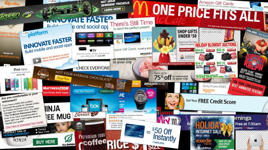
Too Many Ads
Source: teknofilo.com
One of the most popular reasons why customers hate ads is the fact that they find ads very annoying and interruptive. According to the latest stats, more than 30% of users have AdBlock installed or some other blocking plugin and this number is actually growing.
Bad navigation
Your website’s navigation is one of the most important elements on the page, and if it’s not well designed, it can kill your sales.
Most people will leave a website if they can’t find what they’re looking for within 3 seconds, so it’s important that your navigation is easy to understand and use.
Some common navigation mistakes include:
- Not having a search bar
- Making the navigation too complicated
- Not labeling the sections clearly
- Not having a consistent layout throughout the site
If you want people to stay on your website and buy your products, you need to make sure your navigation is up to par. Take the time to design a user-friendly navigation system that will keep people engaged with your site.
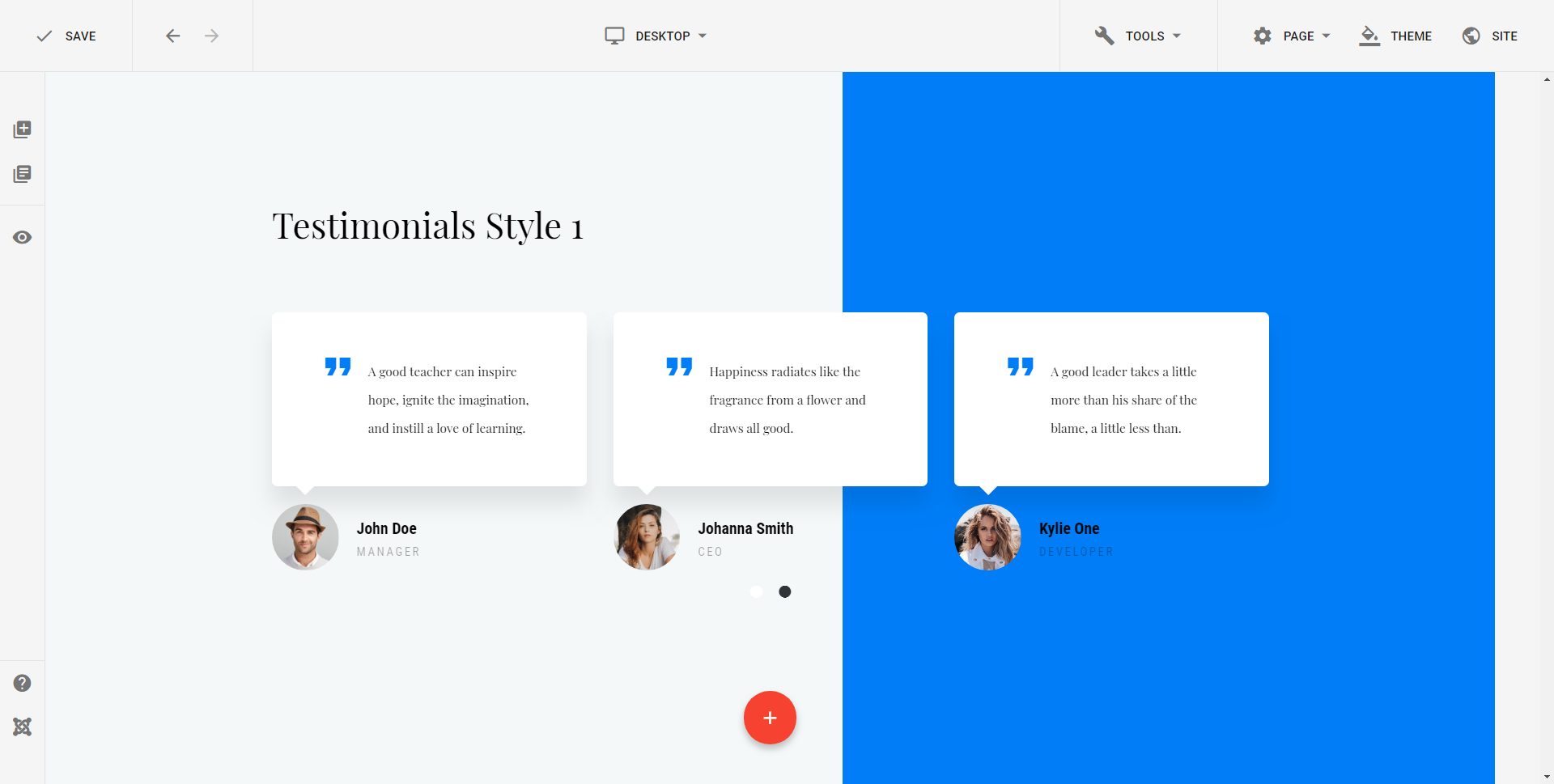
Lack of trust indicators
Source: teknofilo.com
When it comes to website design, one of the most important things to consider is how to instill trust in your visitors. After all, if they don’t trust you, they’re not going to buy anything from you!
There are a few key ways to do this:
- Use testimonials: If you have happy customers, showcase their testimonials on your site. This is one of the most powerful ways to show potential customers that you’re trustworthy.
- Use security badges: If your site is secure (and it should be!), make sure to display security badges prominently. This will help visitors feel confident that their information is safe with you.
- Display contact information: Make it easy for visitors to get in touch with you if they have questions or concerns. Include your email address, phone number, and social media links on every page.
How to avoid making these mistakes
- Don’t make your website design too complicated or busy.
- Keep the most important information “above the fold” so users don’t have to scroll down to find it.
- Use contrasting colors for your text and background to make your website easier to read.
- Make sure your website is compatible with mobile devices so users can access it on the go.
- Use clear and concise text to avoid confusing visitors and losing their attention.
- Don’t use auto-play audio or video on your website, as this can be intrusive and annoying.
- Make sure your website loads quickly by optimizing your images and code.
- Avoid using pop-ups, as these can be intrusive and interfere with the user experience.
- Make sure your website is easy to navigate so visitors can find what they’re looking for quickly and easily.
- Test your website regularly to ensure everything is working properly and fix any errors as soon as possible.
If you want your website designed by professionals with local prices, visit www.lamiservices.com/website-design