

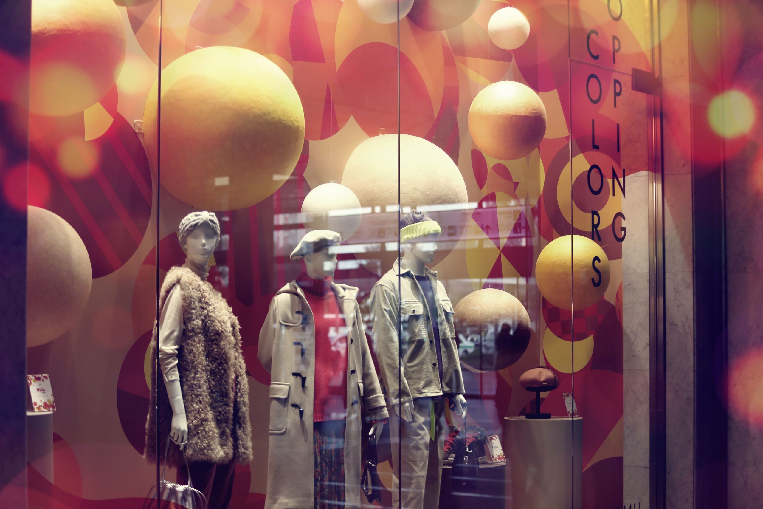
Walk past two neighbouring shops on the same street and you can often guess which one is busier before you push the door open. It is rarely the products. It is whether someone has arranged them so a stranger’s eye knows where to land, and then knows what to do next.
For a small business, a display is the one marketing channel you own outright. No ad auction, no algorithm deciding who sees you, no cost per click. You pay for the space once and the shelf keeps working. Yet most retail display ideas get recycled on the same few statistics, repeated until they sound like natural law. Some survive scrutiny; others quietly fall apart. Below are seven ideas that hold up in practice, with an honest account of how much lift to expect from each.

Table of Contents
What the evidence actually supports
Start with the line you’ve read a hundred times: products placed at eye level are “82% more likely” to be purchased. That figure traces back to a trade-press summary from 2017 and has been copied across the internet ever since. When researchers ran a controlled field experiment instead – moving products between shelves in a North American convenience-store chain and measuring real sales – the effect was smaller and more fragile. Moving an item up to eye level lifted its sales by 5.6% when it came off the top shelf and 10% when it came off the bottom, but under a different shelf reshuffle the same move produced no measurable change at all. My read: eye level matters, but it is a nudge, not a lever. The 2023 field study on the eye-level effect is worth reading in full before you rebuild a whole wall around it.
The sensory side follows the same pattern. A meta-analysis of 66 experiments published in the Journal of Retailing found that stores with background music or a light scent consistently score higher on shopper pleasure, satisfaction and intention to buy – but the average effect across all that research was small to medium. Scent and sound shape the mood of a visit. They will not rescue a bad layout.
That matters because it tells you where to aim your effort. Displays are not decoration, and they are not magic. They reduce the effort a shopper has to spend to notice, understand and want something. Here is roughly what each of the well-known levers is worth, based on the studies rather than the slogans.
| Common belief | What the research found | Source |
|---|---|---|
| “Eye level is buy level” | Moving a product to eye level lifted sales 5.6% from the top shelf and 10% from the bottom, but produced no change under a different shelf reshuffle | Jalali et al., field experiment, 2023 |
| More facings equal more sales | Number of facings strongly shaped attention and brand evaluation, especially for low-share brands and younger shoppers; only top-shelf placement carried through to evaluation | Chandon et al., Journal of Marketing, 2009 |
| Music and scent make people spend more | Across 66 studies (about 15,600 participants), music and scent did raise pleasure, satisfaction and buying intent – with small-to-medium effects | Roschk et al., Journal of Retailing, 2016 |
| An entrance display is just a nice-to-have | A single-brand line-up at the store entrance lifted that brand’s share of category sales from about 7.5% on the middle shelf to roughly 12.6% | Sigurdsson et al., in-store experiment, 2009 |
The pattern is consistent in direction and modest in size. Stack a few of them and they compound. That is the real case for caring about display: not one clever move, but several small correct ones at the same time.
1. Treat the window as a billboard you already pay for
A window is the only part of your shop that works on people who have not decided to come in. The reliable principles are not complicated: one hero product or one clear idea, enough empty space that the eye has somewhere to rest, and lighting that points at the hero rather than flooding the whole glass.
Lighting is where most small shops underspend. Retail merchandising programmes run by Main Street organisations advise spacing storefront lights 18 to 24 inches apart, angling them back into the display instead of out at the street, and choosing warm bulbs under 4500 Kelvin – cold, clinical light makes clothing and natural materials look cheap. A well-lit object simply reads as more valuable, and that perception does quiet work on every passing shopper.
Then there is the calendar. A window left unchanged for three months teaches regular passers-by to stop looking at it, which is the opposite of the goal. Aim for a full change every four to six weeks and a lighter refresh of the interior focal point every two to three. You do not need a new concept each time – a new colour story, a new hero product, or one swapped prop is enough to signal that something has changed.
2. Dump bins: the plainest fixture that still works
High on the list of shop display ideas that get dismissed as unglamorous is the dump bin – the open, low-sided container you find piled with everything from beach towels to dog toys. It works for a simple reason: it invites hands. A shopper can rifle through a bin without feeling watched or obliged, and the physical act of digging surfaces items that a neat shelf would hide.
Position matters more than the bin itself. The strongest spot is a route real customers already walk – beside the entrance, near the till queue, or at the end of an aisle where foot traffic turns. Bins also let you group by price point or occasion, which makes a mixed assortment feel intentional rather than messy. If you are buying fixtures, dump bins for retail stores come in more sizes and finishes than most people expect, from collapsible card units for market days to powder-coated steel you can leave on the floor for years.
One caution: an unattended dump bin reads as clearance. Rotate the contents, keep it no more than two-thirds full, and refresh the top layer every few days. The bin itself is not the idea; the sense of discovery is.
3. Sell the scene, not the shelf
Grouping products by category is how warehouses are organised. Grouping them into a lived scene is how shops sell. A few ceramics, a linen runner, a candle and a folded throw arranged as a corner of a real room let a customer picture those objects in their own home, which is a far shorter mental step than imagining a single vase in isolation.
This is where cross-merchandising earns its keep. Pair the raincoat with the umbrella beside it, the coffee beans with the grinder, the gift with the card. The logic is not to trick anyone into a bigger basket; it is to remove the work of assembling a whole look. If your shop sells anything for homes, gardens or gifting, visual merchandising through storytelling is one of the highest-return changes you can make without spending a cent – and the same principle travels to a pop-up stall, where a single coherent vignette outperforms a table of unrelated stock.
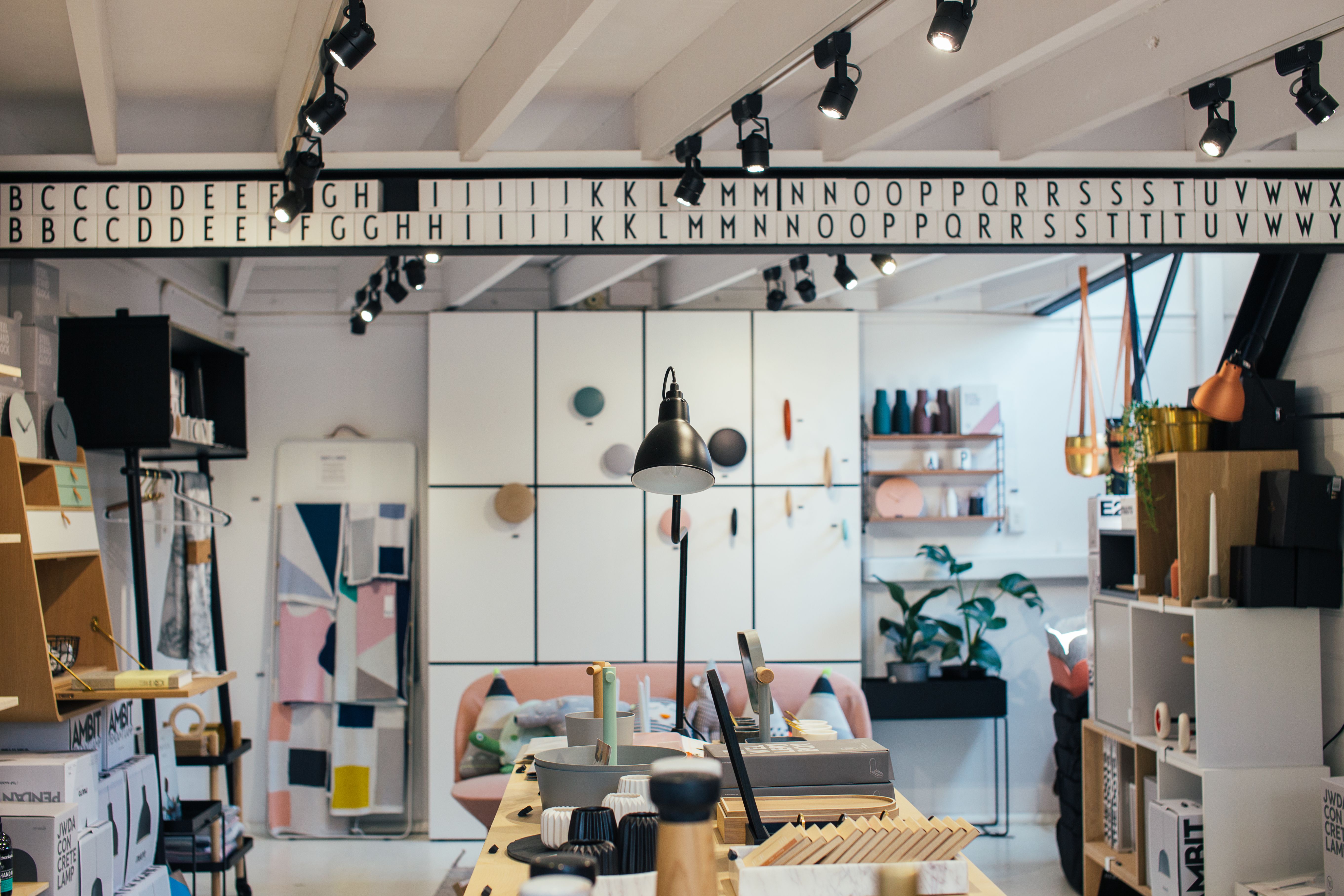
4. Merchandise by occasion, not category
Most independent shops sort stock the way they buy it: by supplier or product type. Shoppers, though, do not arrive with a category in mind. They arrive with an occasion – a housewarming, a first apartment, a weekend away, a birthday for someone difficult. Build displays around those moments and you turn a browsing problem into a choosing problem.
A “Weekend Away” rail that gathers the dress, the bag and the sandals is doing the styling for the customer. A “Hostess Gifts” table that puts the wine, the candle and the serving board together answers a question the shopper was going to ask a member of staff anyway. The items do not need to be expensive or new; they need to belong to the same small story. This is also one of the cheapest display ideas available, because it rearranges what you already own.
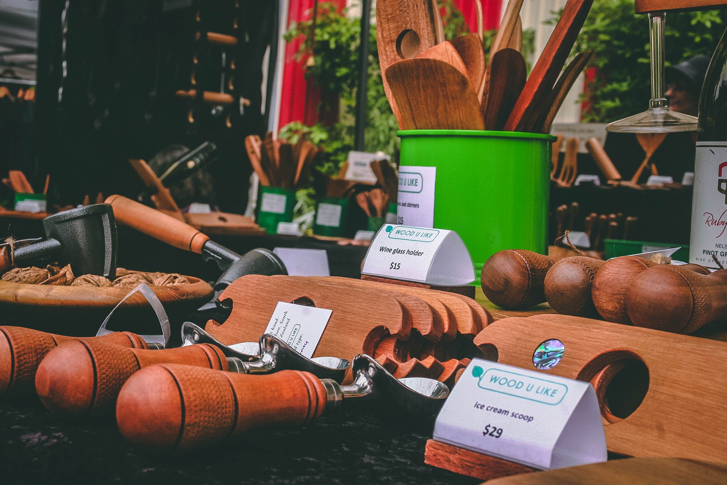
5. Let people touch, test and smell
Shopping online has one built-in disadvantage: you cannot pick anything up. A physical shop can lean into exactly that. A tester tray, a sample dish, an unboxed demonstration unit, a scratch-and-sniff card – each one turns a passive display into something a shopper can verify for themselves.
The research backs the general idea without overselling it. A study of multi-sensory retail cues found that adding sound and scent to an already visual environment did more for time spent and purchases than simply adding more visual material. That said, the gains are real but modest, and the cues have to fit the product. Vanilla and a soft playlist make sense in a homeware shop and feel absurd in a hardware store. The test is congruence: does the extra sensory layer match what you are selling, or is it just noise?
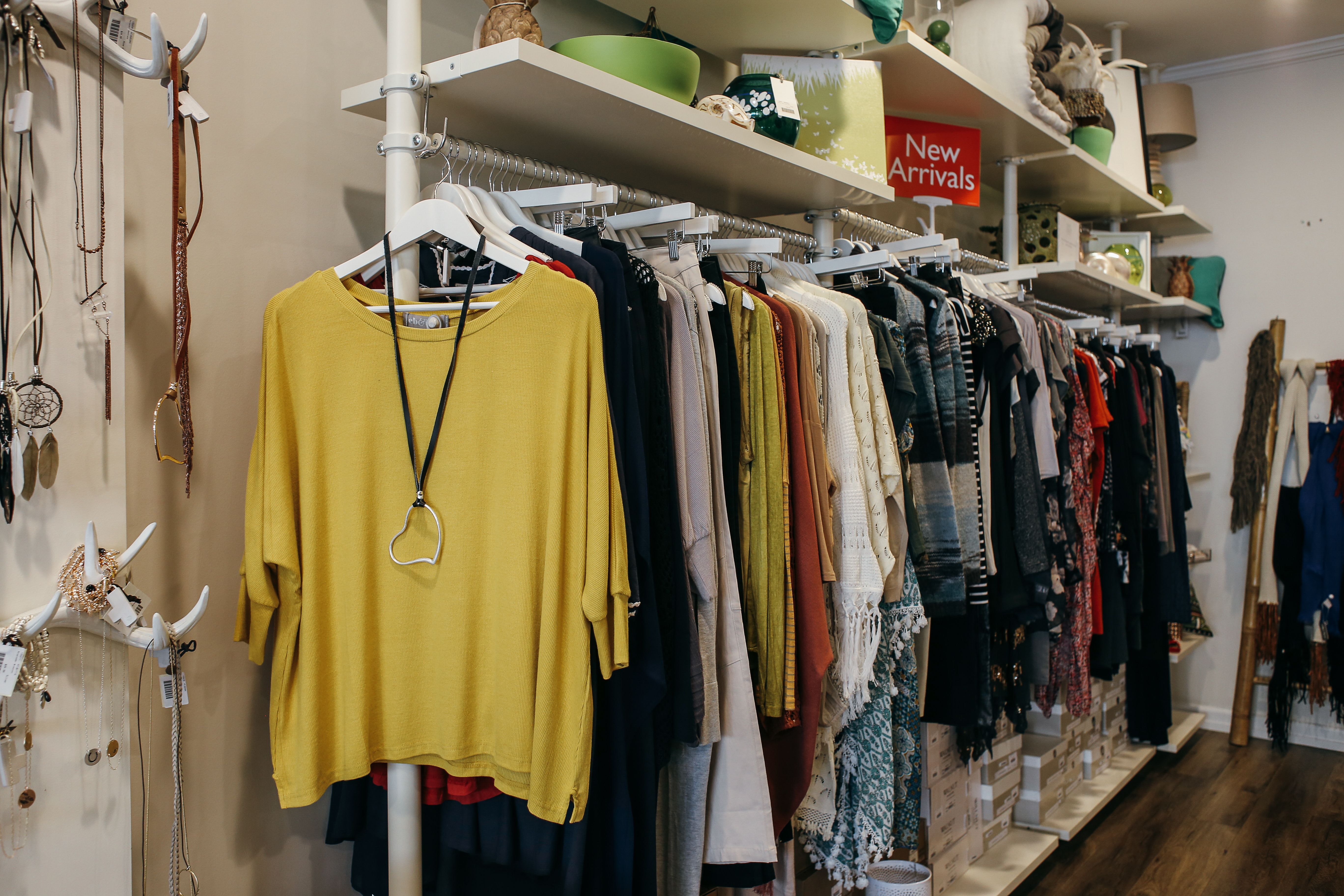
6. Aim light at one thing at a time
Layered lighting is the difference between a shop that looks lit and a shop that looks designed. Ambient light sets the mood of the room. Accent light – a spotlight or a focused display light – picks out the object you want noticed and lets everything else recede. When a display is lit so that it has genuine contrast, the eye goes there without being told.
The practical rules are simple enough to apply in an afternoon. Keep the general lighting consistent, add spotlights on two or three featured displays rather than ten, and match the colour of the light to the goods: warm light flatters fabric and wood, while brighter full-spectrum light suits fresh produce and plants. Perceived value climbs when an object is clearly and warmly lit, which is why the same jumper can look premium under the right lamp and tired under a fluorescent strip.
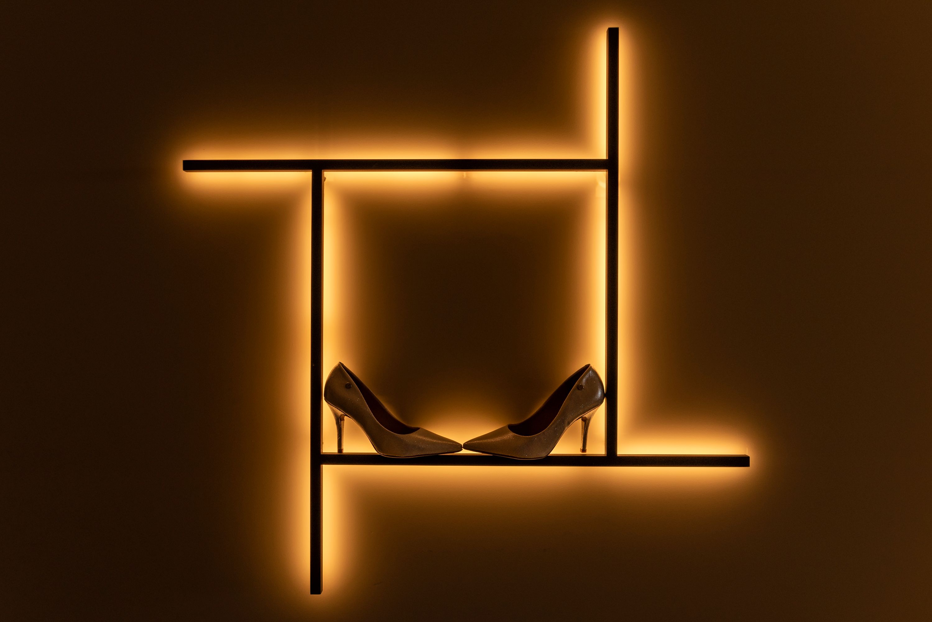
7. Build the corner that ends up on someone’s phone
A display is no longer seen only by the people standing in front of it. One good photograph can put your shop in front of thousands of people who will never walk your street, and the cheapest way to earn that photograph is to design one deliberate, photogenic spot. A painted backdrop, a bold same-colour product wall, a mirror, a hand-lettered sign, a seasonal installation – the point is to give someone a reason to pause and lift their camera.
“It’s always to your benefit as a retailer to create an experience,” says Joline Mujica of WindowsWear, quoted in Shopify’s window display guide. “You want to create a moment that will show up well in an Instagram Story, a Snap, or a video.” That is the whole idea, and it needs no special budget. What it needs is one corner that reads clearly in a small frame, some light on a face or a product, and a small sign with your shop name so the image travels with you attached.
Pick up a couple of the ideas above and you will notice they reinforce each other. A coherent hero product, good light, a bit of touch and a spot worth photographing is not four separate projects; it is one display done properly.
Turn it into a routine, not a one-off
Displays decay. Product sells through, seasons shift, staff get busy, and a table that looked great in October is quietly invisible by December. The shops that stay interesting treat merchandising as a rhythm rather than an annual spring clean.
- Weekly: refill, tidy and re-face the two most prominent zones.
- Every two to three weeks: change one focal display.
- Every four to six weeks: rebuild the window.
- Seasonally: plan the stories and the props in advance.
Two placement details are worth building into that rhythm. First, leave the first few feet inside your door relatively open. Shoppers take a moment to adjust from the street, and almost nobody reads a sign in that decompression zone. Second, note which way people turn – most drift to the right – and put your strongest display where their eyes land first, not where it is convenient for staff.
Then measure, but keep it light. You do not need analytics software to know if a display is working. Track three things: whether foot traffic changes, how fast the featured product sells through, and whether anyone posts about it. If traffic rises but the featured product does not move, the display is attracting attention without selling, and it is the product choice that needs changing, not the whole display. Change one thing at a time and you will actually learn something.
The other thing to watch is clutter. One 2025 retail survey reported that 33% of shoppers had abandoned a store because displays were disorganised, and 46% named not being able to find products as their top frustration. For a small shop, the instinct to use every inch is understandable – but density signals discount, and it kills the focal point. Negative space is not wasted space.
Frequently asked questions
How often should I change my window display?
Every four to six weeks is a sensible baseline for the window, with smaller interior refreshes every two to three weeks. The exact interval matters less than the habit – a display left up for a whole season trains regulars to stop looking.
Do I need to hire a visual merchandiser?
Not necessarily. A single clear focal point, focused lighting and a regular refresh cycle will get you most of the way. Hiring help makes sense for a big seasonal window or a full refit, not for routine upkeep.
What is the best height for products in a display?
The zone between roughly waist and eye height is the most valuable, because it takes no effort to see or reach. Products at eye level were more likely to be bought in field tests, though the size of that effect depends on the layout, so treat it as a good default rather than a guarantee.
How do I know if a display is working?
Watch three signals: changes in foot traffic, the sell-through rate of the featured product, and social mentions. If traffic rises but the product does not sell, adjust the product or the signage rather than assuming the display failed.
Are dump bins too downmarket for a premium shop?
Not if the contents and presentation match the brand. A well-kept bin with a curated mix and a clear price point reads as generous rather than cheap. The failure mode is neglect – an overfilled, unrotated bin that looks like a clearance pile.
How this article was put together
To write this, I went to the primary research rather than the summaries that usually circulate. The eye-level and shelf-placement claims were checked against field experiments in real stores, not lab studies, and the sensory claims against a meta-analysis of 66 experiments. Where a widely repeated statistic could not be traced to a credible original source, I left it out or flagged the uncertainty. Practical lighting and refresh-cadence guidance draws on retail merchandising programmes for independent shops, and the measurement advice reflects standard retail practice. The studies cited are current as of September 2026; display research moves slowly, but any specific percentage is best read as a direction rather than a promise.