
When it comes to responsive websites, it’s not a matter of squeezing or stretching your design to adjust different screen sizes. It means presenting one website perfectly across screens of multiple sizes.
Some of the main things responsive website services providers have to care for are, things to add, things to remove, things to prioritize and implications of search engines. Most importantly how to manage everything with just one code base?
All these things require a website development company to be on top of its game.
Table of Contents
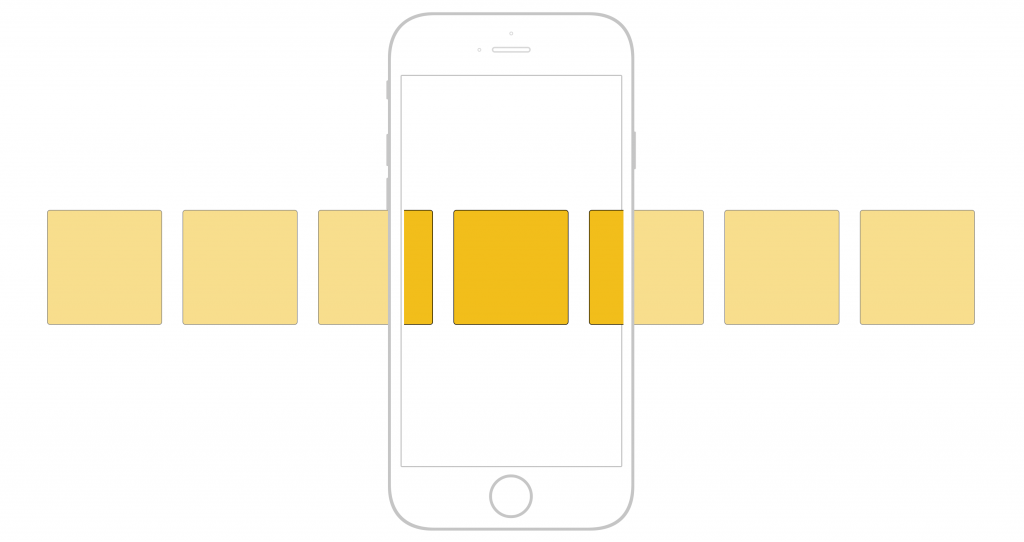
8 best practices used by responsive website services company

img source: ibyteinfomatics.com
If you are also curious to know what it takes for a company to provide fully functional responsive website services, then stay put. We have gathered 8 of the most important practices that e-commerce website development agencies use to come up with a proper and responsive website.
Let’s roll on!
1. Hidden navigation menus
One way of keeping the layout simple on smaller screens is by hiding the main navigation menu. A well-crafted icon or text can show the user where exactly the main menu is. A website development company has two options here. They either include a drop-down menu or the overlay method; where the menu expands and covers the entire screen.
Take a look at the BBC’s menu. It includes the drop-down menu which when tapped, expands. Their page includes multiple collapsed menus so they came up with an idea of using multiple CTAs which allows the user to better understand the page’s hierarchy.
On the other hand, Huge has an overlay menu. This same menu is used on their desktop site where the burger icon is easily visible which keeps the page content simplified.
2. Horizontal swipeable menus
img source: medium.com
This is another simple way top responsive website services providers use to show menus on smaller screens. The menu is visible but they allow the overflow of content off the corners of the page. The visibility of a part of the text indicates to the users that they need to swipe it to reveal.
This menu style has been adapted by The Guardian which is horizontal and swipeable. It also comes with an additional CTA to see ‘ALL’. When tapped, this CTA appears as a drop-down option. According to e-commerce website development experts, it is a wonderful example of incorporating multiple methods in one space.
3. Provide large buttons and clickable link areas
When making responsive sites that are fully functional on mobiles, make the buttons large enough so that they can be tapped easily. This instruction must not be followed for smaller screen sizes; you can have large clickable areas on any device or screen size. These include tabs, laptops, and PCs.
Having buttons that are clearly visible and large in size improves usability. Apart from buttons, text links should also be large and this is how people will find it easier to click or tap on them. For instance, you have a news website and the grid containing headlines with a text link that says, ‘Read More’.
Instead of making this short text a link, make sure you include the entire block as a link. This makes it easier for the users to click and enter into another page. If you provide them with easy to use options, they will have a better experience and will love it.
Consider the example of Oliver Bonas’s ‘Add to Basket’ button which is clear, large and makes it visible as it has a contrasting color to the entire theme.
Also, the buttons on the Pretty Green Energy are big and it comes with large clickable areas on the content list item.
4. Balance of font weight and size

img source: imgix.net
Another best practice for responsive websites used by the leading responsive website services providers is the balance amongst headers and the paragraph texts. If you are creating a website for mobile, large headers don’t appear pretty. This is where the ratio between the two comes.
When we consider the latest smartphones, they all come with high-resolution screens. This allows users to easily read the content. When considering mobile phones, you can make the text size a bit smaller and make it large when it comes to larger displays like laptops and PCs.
An example of this responsive website practice can be seen on the website of Nike. On their desktop site, they have gone with larger sizes which perfectly complements the banner. While for mobile, they have reduced the font size to make it fit in one line.
The same tactic has been practiced by No Drama. They have reduced the H1 title on mobile so that its visibility is decent and doesn’t overshadow the complete page.
5. Optimal reading widths

img source: freshconsulting.com
When making a wider layout for big screen sizes, make sure you consider the length of the content lines. In case the lines of content are too long, the readers will find it difficult to read as they will have to follow the text from line to line.
Likewise, if the length of the lines is too short, you are breaking the rhythm of the readers and they have to move their eyes back and forth. Also, if one line doesn’t contain a simple point and it is carried in 2-3 lines, it looks awkward.
According to one of the leading custom web development companies in the USA Brandezk, the best length of the line on mobile should be around 60-75 characters. This can be achieved if you maintain a text area width of 500/700 pixels.
Hubspot is doing it tremendously and catching the attention of the user. 99u is also a prominent name that keeps its pages balanced by limiting the reading width. Their pages include simple share links and sidebar, which don’t distract us from the content.
The Guardian also makes wise use of white space and creates a clutter-free and simple reading width.
6. Vital information near the top on mobile

img source: huffingtonpost.com
All successful websites have fixed their most important information and CTAs like number/emails/contact info and buy or subscribe info at the top on mobile pages. Mobile users are always in a hurry and want quick bits of information without having to do much. This practice works best for larger screen sizes too.
The sizes of browsers are also varying, putting the right information and CTAs at the top is going to benefit you. For instance, if you have an e-commerce site, your e-commerce website development agency will make sure that the ‘Buy’ or ‘Add to cart’ CTAs are prominent and easy to see. Readers don’t always want to scroll down in search of such CTAs.
This practice has been best used by a number of businesses. Metris Kitchens is one of the thousands who have placed the most vital CTAs at the top of the screen. They want the visitor to see their contact info right away so that they don’t feel lost.
When you visit the eBay site, via your mobile, the price and buy it now buttons are the most prominent.
7. Change the order of content blocks when they collapse on smaller screens
Figure the most important things that you want to be displayed on the mobile screen. Once done, now you can adjust the content order accordingly. You can accomplish it via CSS.
While on the desktop site, you have text content area and image area next to each other. You have to decide which is more relevant. When considering a mobile page, a sidebar and content block are there. In case it collapses, the sidebar will appear on top will be pushing the entire content down the page. This makes it feasible to swap it on the mobile page.
If you happen to visit the Melanie F product page, you will see the image of the product on top. While on the desktop, the info is visible right beside the product; on its right-hand side.
8. Hiding content on a smaller screen

img source: seoblog.com
When it comes to mobile sites, e-commerce website development experts hide the content to ease things. This content may still be visible on larger screens. On mobiles, they do it by completely camouflaging it or by using tabs and accordions to hide and show content.
This is a great tactic if you want a simple mobile page that is clutter-free. It also eases the journey of the visitor as now they can go through the most important information with clear options that allows them to dive into more content; if they want to.
christianlouboutin.com is the perfect example of hiding content on smaller screens. This way, they have simplified their header and showed only the shortened version of information with the product image as the first content block.
Bottom line

img source: kbworks.org
Responsive website services providers such as Bizop.org emphasize all the above mentioned best practices as these are some of the top tactics that allow you to reap huge rewards if done accordingly. Another point in favor of these responsive practices is that mobile traffic soars a lot higher, in the current times, than anybody expects.
And surprisingly, it will grow on with every passing day.
So, if you haven’t invested in a responsive site yet, you are not doing any favor to the mobile prospects who land on your website only to experience a non-responsive website.
If it is responsive and incorporates all the best practices advised by the top custom web development services, you will gain a lot of fruitful results. Because this way, your mobile website and sales gained through mobile will not complement the desktop results, but they will lead the desktop analytics.


