Dashboard Redesign: How to Move Your Power BI Reports from Static Charts to Click-Driven Experiences
If you have spent any time building reports, you know the feeling. You spend hours connecting data sources, cleaning up columns, and building what looks like a beautiful dashboard. You present it to the stakeholders, they nod, say “looks good,” and then… nothing. A week later, you check the usage metrics, and barely anyone is looking at it.
As a senior Power BI developer, I have seen this scenario play out countless times. The problem usually is not the data itself. The problem is that the report is static. It is a digital poster, not an analytical tool.
Users today do not just want to see a chart; they want to ask questions of that chart. They want to click on a bar representing a specific region and instantly see the rest of the page filter to show details for that exact area. They want a click-driven experience.
This article will guide you on how to redesign your Power BI dashboards, moving them away from static charts and transforming them into interactive, user-friendly applications that actually drive business decisions.
Table of Contents
Why Static Dashboards Fail (And Interactive Ones Succeed)
Before we get into the “how,” we need to understand the “why.” Why is interactivity so crucial for successful Power BI reporting?
Static reports are fundamentally limited. They present a single, pre-defined view of the data. If a user has a follow-up question – like “Why did sales drop in Q3 for the North region?” – a static report cannot answer it. The user either has to ask the developer for a new report or export the data to Excel and figure it out themselves. Both options defeat the purpose of having a BI tool.
Interactive dashboards, on the other hand, empower the end-user. By using features like cross-filtering, drill-downs, and bookmarks, you turn a single page into a dynamic exploration tool. This leads to several key benefits:
- Higher User Adoption: When users can answer their own questions, they use the tool more often.
- Faster Insights: Interactivity reduces the time it takes to go from asking a question to finding the answer.
- Reduced Developer Workload: You spend less time answering ad-hoc data requests because users can self-serve.
- Better Decision Making: Dynamic data visualization allows for deeper analysis and more informed choices.
If you are looking to truly master these concepts and build enterprise-grade reports, consider enrolling in a comprehensive Power BI Course. It is the fastest way to move from basic chart-building to advanced data modeling and dashboard design.
The Foundations of a Click-Driven Experience
Moving from static to interactive requires a shift in how you design your Power BI reports. You must start thinking about the user journey. What will they click first? What information do they need next?
Here are the core techniques to implement during your dashboard redesign.
1. Mastering Cross-Filtering and Cross-Highlighting
This is the most basic, yet most powerful, interactive feature in Power BI. By default, visuals on a report page interact with each other. If you click a bar on a column chart, the other charts on the page will either filter or highlight to reflect that selection.
However, the default settings are not always the best. As a designer, you need to intentionally manage these interactions.
How to optimize it:
- Edit Interactions: Go to the “Format” tab and select “Edit Interactions.” This allows you to define exactly how one visual affects another.
- Filter vs. Highlight: Sometimes, highlighting (dimming the unselected data) is confusing. Often, setting the interaction to “Filter” (removing the unselected data entirely) provides a much cleaner and easier-to-understand view.
- Turn off unnecessary interactions: If a card visual showing “Total Sales” should always show the grand total, turn off interactions from other visuals so it does not change when users click around.
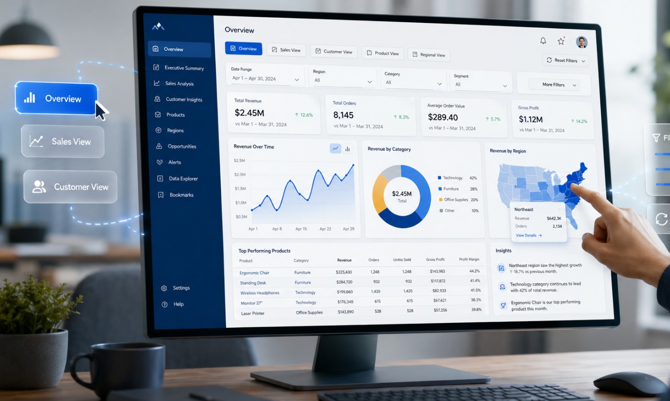
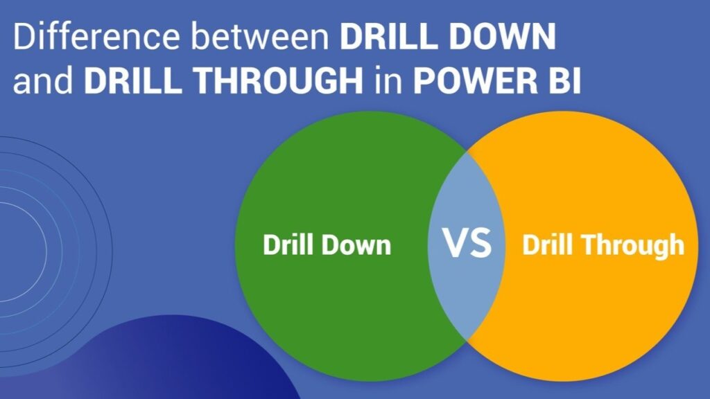
2. Utilizing Drill-Downs and Drill-Throughs
Source: linkedin.com
Drill-downs and drill-throughs are essential for keeping your main dashboard clean while still providing access to granular details.
Drill-Down:
This feature allows a user to explore data within a single visual, moving from a high-level summary to detailed data. For example, a user can look at yearly sales, click a specific year, and drill down to see quarterly sales for that year, then down to monthly sales.
- Pro Tip: Always clearly indicate to the user that a visual can be drilled into. You can do this by turning on the drill-down icons in the visual header or by adding a small text note.
Drill-Through:
This is for when you have too much detail for one visual. Drill-through allows a user to right-click on a data point on one page (like a specific product category) and jump to an entirely different, hidden page that is automatically filtered for that exact product category.
- Pro Tip: Create a dedicated “Details Page” specifically for drill-throughs. Include a prominent “Back” button so users do not get lost in the report.
3. Creating App-Like Navigation with Buttons and Bookmarks
This is where your Power BI dashboard truly becomes an application. Bookmarks capture the current state of a report page, including filters, slicers, and the visibility of visuals. Buttons are used to trigger those bookmarks.
Common use cases:
- Custom Navigation Menus: Instead of relying on the default Power BI page tabs at the bottom, build a custom navigation bar on the left side or top of your page using buttons. This looks more professional and is more intuitive for web users.
- Swapping Visuals: Do your users argue over whether a bar chart or a matrix table is better? Give them both. Place the visuals on top of each other, and use buttons and bookmarks to toggle the visibility of one versus the other.
- Reset Filters: Always include a “Clear Filters” or “Reset to Default” button. As users click through multiple slicers and charts, it is easy for them to get confused about what they are actually looking at. A reset button brings them back to a clean slate.
4. Designing Smart and Space-Saving Slicers
Slicers are necessary, but they take up valuable real estate on your dashboard. A key part of redesigning for a better user experience is optimizing how filters are applied.
Best Practices:
- Use the Filter Pane: Power BI has a built-in filter pane on the right side. Move less frequently used slicers there to free up canvas space.
- Dropdown Slicers: If a slicer has many options, use a dropdown format instead of a list to save space.
- Collapsible Slicer Panels: This is an advanced technique using bookmarks. You create a panel of slicers that slides in when a user clicks a “Filter” button and slides out when they close it. This gives you maximum canvas space for your charts.
5. Implementing Tooltips for Extra Context
Sometimes you want to show a user more information without making them click or drill down. This is where custom report page tooltips shine.
Instead of the standard black box tooltip that appears when you hover over a data point, you can design an entire mini-page in Power BI and set it to appear as a tooltip.
For instance, if a user hovers over a state on a map visual, a small line chart could pop up showing the sales trend for that specific state over the last 12 months. This provides immediate, contextual insights without cluttering the main dashboard.
The Mindset Shift: From Builder to Designer
Source: linkedin.com
Redesigning your Power BI reports requires a shift in how you approach your work. You are no longer just connecting data and dragging charts onto a canvas. You are designing a user interface.
Before you build anything, ask yourself:
- Who is using this report?
- What specific questions do they need to answer every day?
- What is the logical flow of their analysis?
By answering these questions, you can structure your click-driven experience effectively. Start with a high-level overview on the main page. Use interactive elements like cross-filtering and drill-throughs to let users dig deeper into the specific areas that matter to them.
Remember, the goal of data visualization is not just to display numbers; it is to facilitate understanding. A static chart might look nice, but an interactive dashboard drives action. By implementing these techniques, you will significantly increase the value of your Power BI reports and ensure your stakeholders are actually using the tools you work so hard to build.